Your pricing page is the most important page on your site. Period. Every other page works to guide your user slowly through the sales and marketing funnels until reaching the final gate between you gaining some life saving revenue and another sale lost. Even though the importance of this revenue driving page stares every marketer, product manager, and designer in the face, we’re continually surprised at how some of the pages we come across are so downright awful. Do these businesses realize how much money they’re losing just from a poor pricing page, let alone poor pricing? Unfortunately, they don’t, but that’s why we’re here.
Don’t worry though, we’re also thrilled by some of the pages we see out there, to the extent that some pages make us feel all warm and fuzzy inside. Don’t judge us. We love pricing, and the pricing page is one of the biggest levers on a phenomenal pricing strategy. As such, you can’t blame us for loving pricing pages more than a fourteen year old girl loves Justin Bieber. We got the pricing fever.
To make your life easier, we’re going to go through five of the most phenomenal pricing page features we’ve seen to date. We’re not entirely sure if these folks utilized data in their pricing strategy or even approached their price optimization as a process, meaning the numbers on these pages could be all wrong for their target segments. Yet, at least they’re rocking some great best practices that you can utilize, as well.
1. Contextual Pricing - Onepager
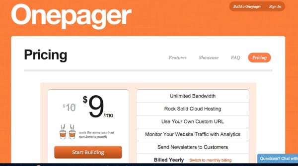
If I tried to sell you a widget for $10/month, would you buy it? Doesn’t really matter what it is, but $10 isn’t too much, right? Well, what if told you that this widget was providing you a lot of value, and was only costing you about “two lattes” per month? Does that change your mind a bit? It’s only two lattes.
Enough with the questions, but this tactic is what Onepager, a company providing a beautiful solution for building small business websites, has done. Take a look at their page below. They’re providing a ton of value on the right with their features and benefits to the user, and contextualizing what that price means for the customer. We’ve seen more expensive products use this tactic by positioning their product as a percentage of a full time employee. Would you use a product that replaced one full time marketer for $500/month? I would.
The bottom line: Contextualizing your price humanizes the experience, lowering the barrier to entry for an elusive number, because as we explained in a previous post, you can take advantage of innumeracy within your pricing strategy.
2. Pricing Along a Value Metric - Qualaroo and DropBox
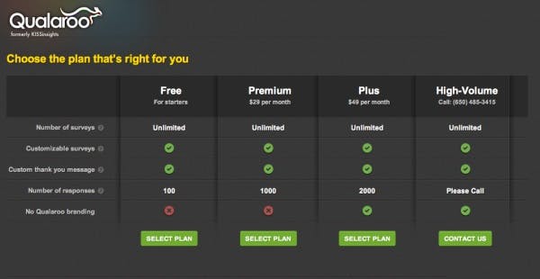
One of the greatest page characteristics out there concerns pricing along a value metric, essentially if the person or business using your products gets more out of your product, then they should be charged more. Pricing in this manner allows you to justify a price increase from one tier to the next. Take a look at Qualaroo (formerly KISSinsights). If I use Qualaroo for web insights, I’m really looking to get responses from my customers. Essentially, that’s where the value is provided - customer responses. Notice how all of the plans are basically the same, except for the number of responses you’re allowed to glean. The only differentiating feature is whether you get to custom brand the questions or not, and I’m sure the team over there has figured out that certain customer personas are willing to have Qualaroo branding for a cheaper price, while others will pay more for no Qualaroo branding.
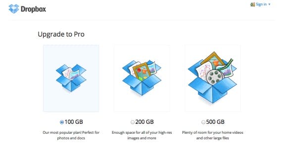
Dropbox is also brilliant at charging based on a value metric - how much cloud storage you’re receiving. If you store more, you pay more, but you also get an opportunity for more free storage if you help build DropBox’s business through referrals.
The bottom line: Your tiers must be priced along the value you’re providing a customer. If it’s not simple to do (in the case of some marketing companies that can’t track conversions), then find a way to contextualize the value you’re providing or check out the next feature (you probably fall into that category).
3. Grow with Your Customer - GitHub and MailChimp
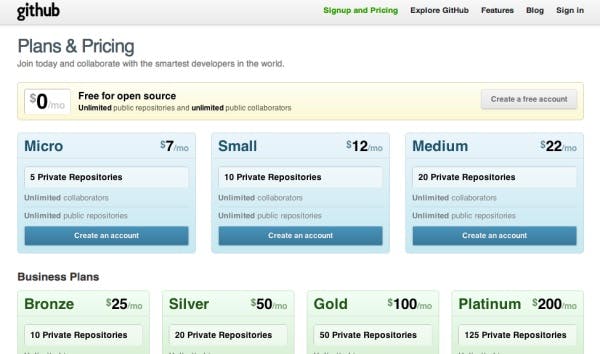
As mentioned above, it’s not always easy to price based on a value metric. In the case of GitHub, the pricing model would become pretty complicated if they started pricing based on “amount of time we’re saving you.” Therefore, going hand in hand with pricing along a value metric, comes setting up your tiers so your price grows with your customer. This method allows you to still focus on capturing numerous types of customers at different stages in their lifecycle.
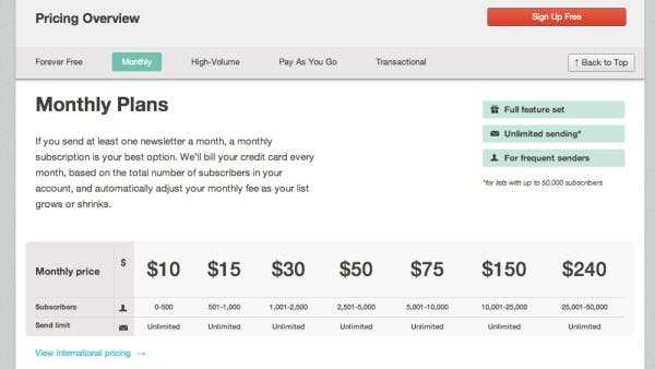
Take a look at GitHub and MailChimp below. These pages are a bit cumbersome and complicated, but their pricing is set up in a discrete manner, capturing customers in numerous segments. As soon as you cross a threshold (more contacts in your list or more private repositories) the price goes up.
The bottom line: Allowing your customers to grow with you, allows you to have the ultimate customer for life, because you’re providing value at all stages of their business.
4. Non-Traditional Plan Names - Get Satisfaction and Wufoo
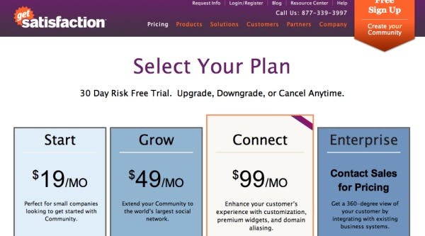
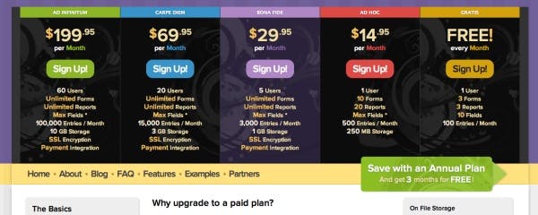
Basic. Plus. Enterprise. Hundreds, maybe thousands, of pricing pages work with these three plan names or slight variations. This is sooooooo boring. Even using “silver, gold, or platinum” is boring too. You shouldn’t waste valuable pixels on such default names for your plans. Instead, do what companies like Get Satisfaction or Wufoo have done. Both of the pages have some issues, but they’re at least out of the ordinary, inspiring me to explore more of the page and contemplate pulling the purchase trigger. Plus, each of the names correspond to what the next level plan means beyond the previous plan. Although, you’ll need to know a little latin for Wufoo’s. :)
The bottom line: Get creative about your plan names to foster a connection between a customer coming through the door and a particular plan. Don’t waste those pixels on the default.
5. Just be Downright Pretty - Wistia
Sometimes when I’m having a rough day, I look at Wistia’s pricing page. I’m not kidding. It makes me happy. It makes me care. It makes me long for an entire design team. Take a second to look at it. Click through and play the video that’s front and center on it. I don’t even care if you churn away from the blog. It’s that beautiful.
Design matters. We all know this, but with that knowledge you should take some time to design a phenomenal looking pricing page. Rumor has it that Wistia actually hired an architect (the building kind) to design their page, taking the time to focus a ton of time and energy into the most important page on their site.
No idea if their pricing is accurate, but I love how they put their product (video hosting) front and center on the page, included pricing along a value metric, and focused on the features that matter to their customers.
The bottom line: Sometimes beauty can get you through life. When you’re a business, beauty won’t necessarily make you huge, but in the case of Wistia their beautiful page puts the already useful product over the top.

To learn more, check out our Pricing Strategy ebook, or request a free pricing audit from our experts. We're here to help!


